What are Button HSLs?
- Getting Started
- Bot Building
- Smart Agent Chat
- Conversation Design
-
Developer Guides
Code Step Integration Static Step Integration Shopify Integration SETU Integration Exotel Integration CIBIL integration Freshdesk KMS Integration PayU Integration Zendesk Guide Integration Twilio Integration Razorpay Integration LeadSquared Integration USU(Unymira) Integration Helo(VivaConnect) Integration Salesforce KMS Integration Stripe Integration PayPal Integration CleverTap Integration Fynd Integration HubSpot Integration Magento Integration WooCommerce Integration Microsoft Dynamics 365 Integration
- Deployment
- External Agent Tool Setup
- Analytics & Reporting
- Notifications
- Commerce Plus
- Troubleshooting Guides
- Release Notes
Table of Contents
Buttons do not disappear after clicking on them. This is useful for menu-like buttons which the user can click multiple times.
Also in some cases, you might want to do more than just sending a text message with the tap of the button. For example, you might want to add a button to make a phone call or send an email.
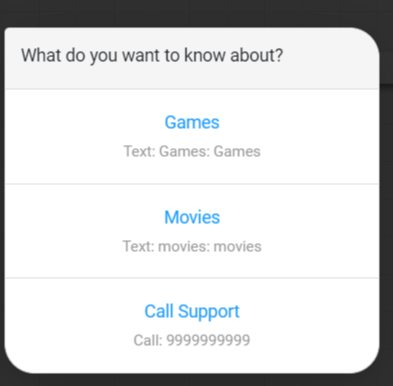
In such cases, you can add persistent buttons of different types by choosing the Buttons option from the HSL menu.
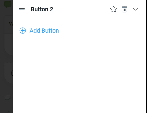
On opening the Button menu, you have an option to enter the text message to be sent with the buttons. After adding the text message, you can click on the + Add Button link to add a button.
Inside the button menu, there are two fields. The first is the Button type and the second is the Button text. Button type refers to the type of the button. The different options available here are:
Text
The first and most simple type of button is text. On clicking this button a text message is sent from the user to the bot.
To use this button type select the Text option in the button type dropdown. Then fill in the title of the button in the button text field. Finally, you can enter the message that needs to be sent in the Message to send field.
Open Screen
In some cases, you might want to open a new visual screen to collect some information or show some information. An example is opening a link to show a form or display information. In such cases, you can use the Open Screen button type.
To use this button type, just set the button type as Open Screen. Then, set the button text and choose the type of screen you want to open from Screen to open drop-down. Some of the screen types available are:
-
Carousel Detail: Opens a screen that has a carousel of an image on the top and space underneath for text. This option comes with both Text and Button.
-
Upload / Take photo: Pops up a dialog box to choose an image from the camera/gallery. This option comes for both Native Apps and WebSDK.
-
Upload document: Pops up a dialog box through which the end user can choose and upload a document from their device. When you select this option, it brings up another drop-down below it by the name of Select allowed file types. This lets you limit the file extensions/types that are eligible for uploading.
-
Upload Video: Pops up the dialog box through which the end user can choose and upload a video from their device. When you select this option, it brings up another drop-down below it by the name of Select allowed file types. This lets you limit the file extensions/types that are eligible for uploading.
-
Open Channel: Opens up a new channel. The details of the channel to be opened are given in the payload.
-
Send Location: Opens place picker and enables a user to send a particular location.
-
Link: Opens the mentioned link on a new tab. You'll also see two toggle buttons:
-
Launch in same tab
If you turn on this toggle, your link will be opened within the same page when the button is clicked. When this toggle is OFF (which is the default setting), the link will be opened in a separate tab.
-
Launch in app
If you turn on this toggle, your link will be opened as an in-app browser (inside a mobile app). If the toggle is OFF (which is the default setting), then the link will be opened outside the app (in the phone’s default browser).
-
Launch in same tab
- Webview: Opens up a custom Webview.
Click here to see the steps involved ahead in all screen types above. Note that this is a sample for image uploading and the steps are nearly the same for all screen types.
Call
This option is useful when you want the user to be able to make a call at the click of the button. Clicking this button will open the default calling app and prefill the number to be called.
You can use this by setting the button type as Call. Then you can set the button text and the Phone Number to be prefilled.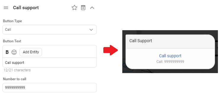
SMS
This option is useful if you want to let the user send an SMS at the click of a button. Clicking this button will open the default SMS app on the user's phone with a prefilled SMS message.
You can use this by setting the button type as SMS. Then you can set the button text and the SMS message to be prefilled.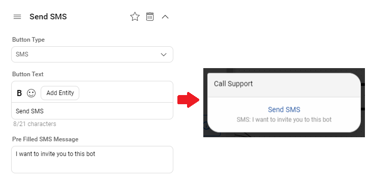
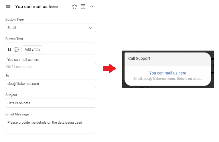
This type of button is useful when you want to let the user send an email with the click of the button. You can configure the "to email address", "subject" and "message" of the email in button settings. When the user clicks on the button, the bot will open the default email client of the user. It will preload the email data into the client as well.
You can use this button by setting button type as Email. Then you get options to set the button title, email address, subject, and the message body.
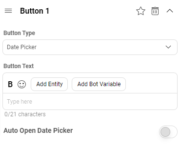
Date Picker
Output: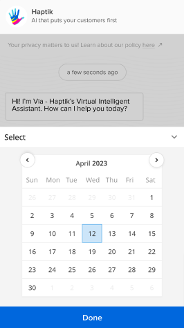
List Picker
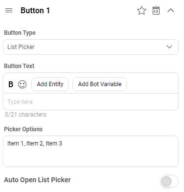
This button will launch a list picker, which will present a list of options listed by you. Listing your options is a cakewalk, as you just need to mention them (in the Picker Options field) using a comma as a separator. For example, Item 1, Item 2, Item 3, etc.
It does have a toggle button with the name of “Auto Open List Picker”, which will open the list picker automatically if it is turned on. Please note that this toggle button is set to off by default.
Output: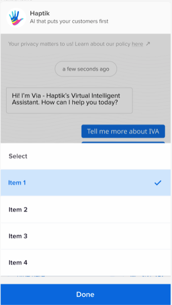
Feedback Flow
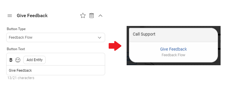
This type of button can be used to trigger a feedback flow. The feedback flow asks the user to rate the bot on a scale of 5 stars. The user can also provide any specific feedback in free text form after that.
You can use this button by setting button type as Feedback Flow. After that you set the button text and click on Done to complete the setup.
Share
There might be cases where you want to let users share some content. In such cases you might want to provide a share button.
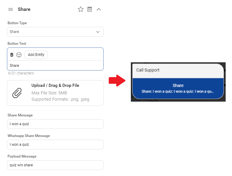
You can add this button by setting the type as Share. After that you have options to provide
- Button text: The title or text inside the share button
- Image: The image to be shared on the click of the button
- Share Message: The message to be shared
- Whatsapp Share Message: In whatsapp there is an option to provide additional message while sharing things. This field can be used to add that message.
- Payload Message: The message to be sent to the bot backend when user clicks the share button. This message can be used to track message clicks.
- Show Share Option: This option can be turned on if you want to show the native share options from Android/IOS.
Sample Button
{
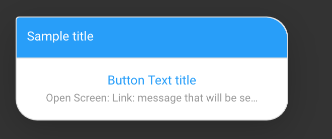
 "text": "Click on the below button to be redirected",
 "type": "BUTTON",
 "data": {
 "items": [
 {
 "actionable_text": "Google",
 "location_required": false,
 "is_default": 0,
 "uri": "LINK",
 "type": "APP_ACTION",
 "payload": {
 "message": "message that will be sent as a chat message on behalf of the user",
 "url": "https://google.com",
 "gogo_message": ""
 }
 }
 ]
 }
}
Sample Output
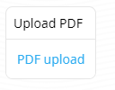
HSL to upload PDF
{
 "text": "Upload PDF",
 "type": "BUTTON",
 "data": {
 "items": [
 {
 "actionable_text": "PDF upload",
 "location_required": false,
 "is_default": 0,
 "uri": "DOCUMENT_PICKER",
 "type": "APP_ACTION",
 "payload": {
 "mime_types": [
 "application/pdf",
 "application/msword",
 "application/vnd.openxmlformats-officedocument.wordprocessingml.document",
 "application/vnd.ms-excel",
 "application/vnd.openxmlformats-officedocument.spreadsheetml.sheet",
 "text/csv",
 "comma-separated-values"
 ]
 }
 }
 ]
 },
 "isNew": false
}
HSLs only support link to PDF, i.e. when you are sending a PDF to the user, you will have to provide the PDF URL and not send the actual PDF as an attachment.
Output
| Property Name | Description | Required |
|---|---|---|
| text | The main text that is shown in the Button element | Yes |
| type | To be set as BUTTON for a button HSL element | Yes |
| data.items.actionable_text | The text that is displayed to the users | Yes |
| data.items.location_required | DEPRECATED - true or false, if true, location information is sent to backend< | Yes |
| data.items.is_default | If True, this is the default element that is invoked if the image/text part of the element is tapped | Yes |
| data.items.uri | This can take multiple values that is defined in the hsl-properties | Yes |
| data.items.type | This can take multiple values that is defined in the hsl-properties | Yes |
| data.items.payload | This can take multiple values that is defined in the hsl-properties | Yes |
