Understanding different UI elements

Written by Medha Anand
Updated on August 30th, 2021
- Getting Started
- Bot Building
- Smart Agent Chat
- Conversation Design
-
Developer Guides
Code Step Integration Static Step Integration Shopify Integration SETU Integration Exotel Integration CIBIL integration Freshdesk KMS Integration PayU Integration Zendesk Guide Integration Twilio Integration Razorpay Integration LeadSquared Integration USU(Unymira) Integration Helo(VivaConnect) Integration Salesforce KMS Integration Stripe Integration PayPal Integration CleverTap Integration Fynd Integration HubSpot Integration Magento Integration WooCommerce Integration Microsoft Dynamics 365 Integration
- Deployment
- External Agent Tool Setup
- Analytics & Reporting
- Notifications
- Commerce Plus
- Troubleshooting Guides
- Release Notes
Table of Contents
Pick your goalContent tone and voice considerationsPick the right termsConversation User Interfaces vs Graphical User InterfacesPicking conversational elements1. Quick Replies (QRs)2. Buttons3. Carousels4. Chat Forms5. Videos6. Images7. Location Picker8. Web-ViewThis section is a collection of general good practices to follow while designing the core utility of your bot. This includes everything from our content cheat sheet to UI elements to handling bot errors.
We recommend that you read this entire section before you start designing your user journey.
Pick your goal
Now that you know how your bot will be initialized, it's important to take a deep breath and analyze your goal. It can be one of the two things:
- Speed: When you’re trying to provide an answer quickly and help the user reach their goal fast. Goal to keep in mind: What’s the fastest way to answer the users’ queries on chat?
- Clarity: When you're trying to explain a concept clearly or provide steps for resolution in a simple way that the user understands. Goal to keep in mind: What’s the clearest and simplest way to answer the users’ query on chat?
Knowing the answer to this will help you when you need to decide between a clear and long journey and a terse but fast journey.
Content tone and voice considerations
- Personality: Does the IVA resonate with the brand's voice of communication? Example: If you’re building a bot for an old trusted banking company, does a chirpy 17-year-old girl voice really complement the brand’s tone?
- Emotional state: Are you able to connect with the user at an emotional level? Example: If your bot is an Insurance Claims Collection bot, your user is probably sad or has been grieving for a personal loss. Is your bot content addressing your user with this in mind?
- Engagement: Are you able to retain the user's attention until the goal is completed? Example: If your bot is a sales bot, will a user make a purchase after conversing with your bot? Is the bot really able to create a connection with the user?
Pick the right terms
A conversation often has several parts that can feel repetitive like Affirmations, Conversation Propellers, Conversation Enders, and so on. Here’s the 🗝 Content Cheatsheet —a content repository of phrases and keywords to use in various situations in any chat flow.
Conversation User Interfaces vs Graphical User Interfaces
Understanding the strengths and weaknesses of CUIs and GUIs will help you decide whether a project is a good use case for a bot or not.
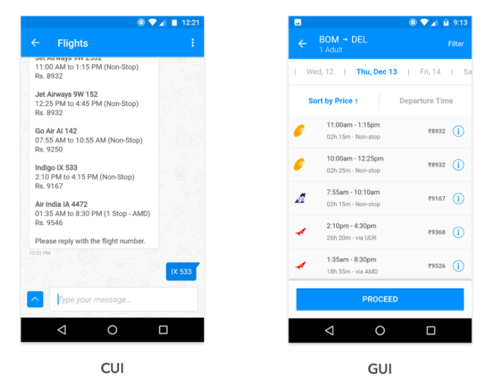
When you’re looking at a list of flights on the screen, it’s easier to tap your preferred one than send a message with the flight number. A GUI can also pack in much more information in the same area than a CUI.
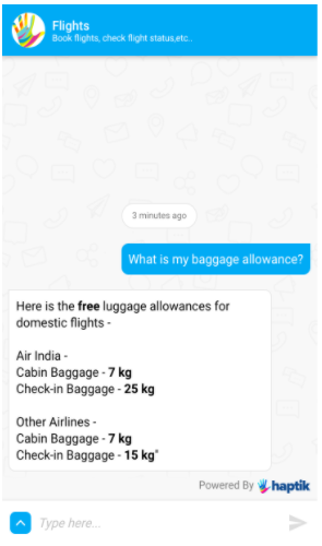
However, once you start packing for the trip, it’s easier to ask/type “baggage allowance” and get a reply with the check-in weight allowance as compared to navigating multiple screens, skimming, and searching through all the information.
Picking conversational elements
While text works great for certain interactions, other interactions may benefit from a GUI. The Haptik platform supports elements such as images, carousels, buttons, and Quick Replies. Use these to break the monotony of your content.
Here is a guide on each of these elements:
1. Quick Replies (QRs)
Tappable buttons that can be used to reply instead of typing out a response.
Quick replies are likely to be the most commonly used interactive element in your user journey. They are extremely useful to provide suggestions to the user and take away the work of typing. Quick replies are the best element to lead the user to the next set of options.
Pros: Tapping is faster and easier than typing for the average user. QRs act as suggestions and are non-persistent (i.e. they disappear after a selection is made).
2. Buttons
An element is used to redirect users to a different flow or page in order to complete a task. Buttons guide users to click on a very clear, persistent Call-To-Action (CTA). You can also use these to provide links to a different page or redirect a user elsewhere. Buttons are persistent elements (i.e. they remain on the screen even after a selection is made).
Tips:
- Use buttons when you want the option to remain on the screen (users have a habit of scrolling back up and tapping on buttons) whereas QRs are best used when there is a clear fork in the flow.
- Buttons occupy vertical space and are not a good element to use when you have many options. Even though Buttons get higher click-throughs than Quick Replies, it’s better to use QRs when you have more than 3 options.
- Make sure that the button text includes a verb at the beginning and use the arrow (↗) if the button will redirect outside the bot. Example: View Plans ↗
- For maximum visibility, use 21 characters at the most for the button’s text.
3. Carousels
A slideshow component for cycling through elements—images or slides of text—like a carousel.
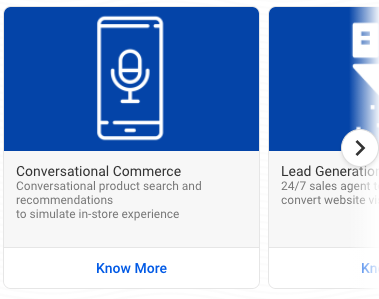
A carousel element is useful to showcase multiple options that have a lot of details or visual elements. In addition to this unique feature, carousels also help beautify and direct the flow. Carousels can have 3 widths - small, medium, and fat.
Tips:
- Limit the number of carousel cards to 4-5 at the most. The first few cards tend to be the most viewed.
- Neatly format the text within the card into lists or paragraphs.
- Use the header for the most important information like product names or order IDs. Use dividers like | or — while showing multiple pieces of information.
- You may use formatting tags like bold, italics to make the text more eye-catching.
4. Chat Forms
An element is used to collect data in a structured format. There are some situations when you want an exact response from your user, or want to make sure that you receive certain information before the user can proceed in the flow. Other times, you may already know the potential responses of a user and it may be faster for her/him to simply tap. This is where forms come in handy.
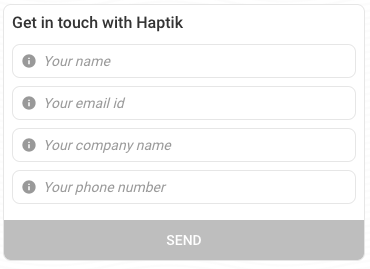
Example: Collect 3-5 pieces of very structured information. E.g. Personal details for an Insurance plan
Tips:
- Forms with more than 4 fields are likely to see a lower completion rate.
- Whenever the input is expected from a user in a structured format, it's best taken in a form.
- QRs vs Forms: Use Quick Replies when there are only a few ways a user can respond. Use Forms when there’s a larger number of responses potential. Resort to free form when there’s a gigantic number of potential responses.
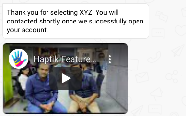
5. Videos
A video element allows you to share a video right within the chat window Almost all platforms like Web SDK, WhatsApp and Facebook allow this feature. You can even use videos to replace an FAQ/concept that's too long to show using text!
6. Images
The image element is a great way to showcase content that is best represented graphically.
Pros:
- To increase readability
- To break the monotony of text
- To condense a lot of text into a chart or easy-to-consume visual
Some ways to use images:
- Explaining how to complete a process. Eg. Logging in to an application
- Showcasing a long list or table of contents
- Showcasing a product
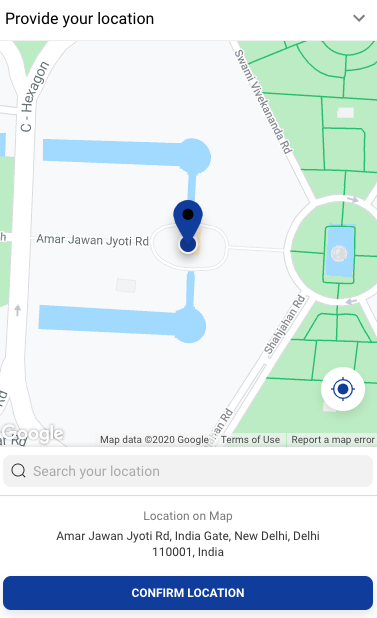
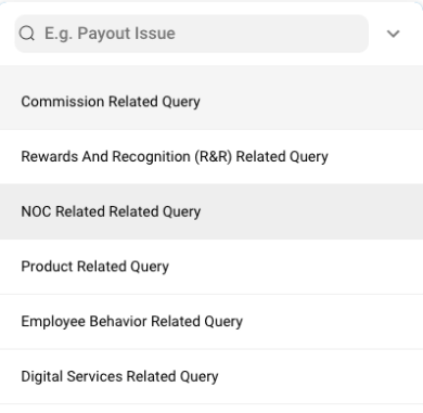
7. Location Picker
The location picker element for the Web SDK allows users to share their location. For the Web SDK, users first need to tap on a button which then opens up a web view with a map. For WhatsApp, the share current location option can be used.
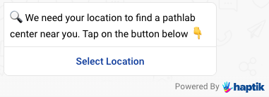
A new window opens up with click of the Location Picker
Considerations:
- Always allow an alternative if the user does not wish to share their location
- Ensure that you provide enough guidance to the user to use the location picker since the UX can be confusing.
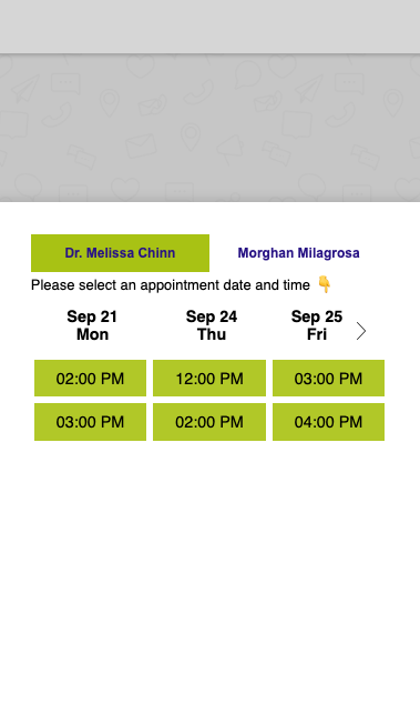
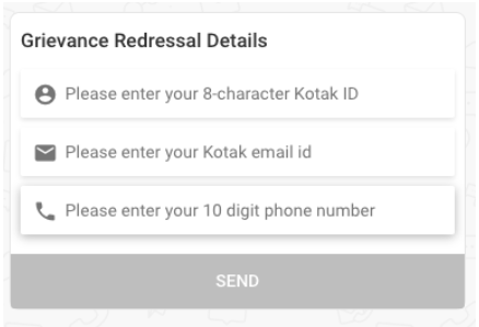
8. Web-View
Web views let you create a custom UI to accept user input for the bot. This means that any type of UI that you need to build a great bot flow is now available. In other words, the IVA is your canvas!
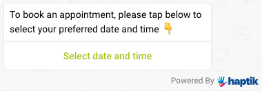
A new window opens up with the click of the button
Considerations:
- These windows are completely flexible in terms of the GUI. Design the UX and copy just as you would for any other GUI.
- A user can invoke a webview by clicking on a button. Design your conversational UX accordingly.
- These reviews can be configured to open at different heights as well.
👉 Take a look here for a quick cheat sheet of available elements and their usage.
Another example
Considerations:
- Put thought into this. Understand how the UI for your product will work and write down all the bits of copy that affect this.
- Keep it short and engaging. You want users to clearly understand what needs to be entered but do it quickly.
- Take care of capitalization and make sure all the words follow the Title case. Example - Recommend a Product.
