What is Form Builder HSL?

Written by Medha Anand
Updated on November 1st, 2022
- Getting Started
- Bot Building
- Smart Agent Chat
- Conversation Design
-
Developer Guides
Code Step Integration Static Step Integration Shopify Integration SETU Integration Exotel Integration CIBIL integration Freshdesk KMS Integration PayU Integration Zendesk Guide Integration Twilio Integration Razorpay Integration LeadSquared Integration USU(Unymira) Integration Helo(VivaConnect) Integration Salesforce KMS Integration Stripe Integration PayPal Integration CleverTap Integration Fynd Integration HubSpot Integration Magento Integration WooCommerce Integration Microsoft Dynamics 365 Integration
- Deployment
- External Agent Tool Setup
- Analytics & Reporting
- Notifications
- Commerce Plus
- Troubleshooting Guides
- Release Notes
Table of Contents
Table of Contents
TextPickerNumberEmailDateTimeSearchDate of BirthMulti PickerDeleting a Form FieldCustomize Send ButtonRe-order the Form FieldsForm HSL on the botWhenever the input is expected from a user in a structured format, it's best taken in a form. For example, an address would be best taken over form with 3-4 fields.
Forms should have a minimum of two fields or else it would not make sense to use forms. For example, when you want to ask users their Name, Phone, Email, and Address to register on your website.
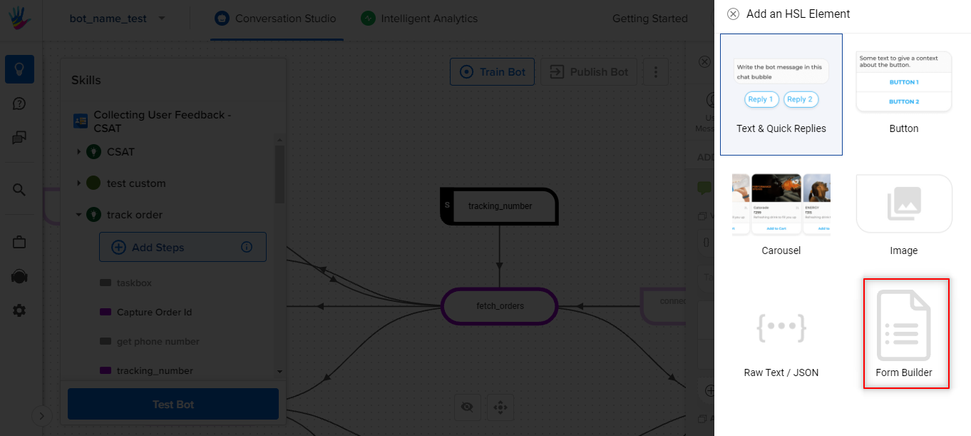
You can configure Forms by clicking on the Add a chat element link, and then selecting Form Builder.
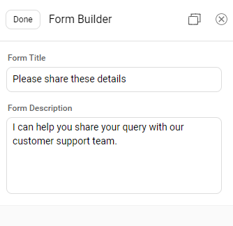
After choosing Forms Builder as the chat element option, you can set the Form Title and Form Description.
- Form Title: This field should convey the action needed from the user. For example, if you are making a form to take delivery address, Form Title can be Please help me with your Delivery address. Also, it is an optional field.
-
Form Description: This is a description of the form. This will be visible on the form. Form Description is also an optional field.
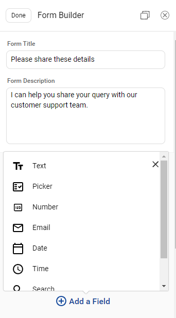
To add a new field on the Form, click on Add a Field button. A pop-up opens up with a list of all the different types of form fields you can choose from.
- Text: This can be used when you want text input from the user.
- Picker: This can be used when you want a user to select any one option from the given multiple options using the dropdown.
- Number: This can be used to get number inputs from the user. Example - Mobile number, SSN, etc.
- Email: This can be used to get the Email-id from the user.
- Date: This can be used to get the date from the user. It uses the calendar widget where users can select the date.
- Time: This can be used to get the time from the user. It uses the clock widget where the user can select the time.
- Search: This field will help you create search options on the IVA.
- Date of Birth: Date of Birth field is used to accept a date from the user.
-
Multi Picker: Multi Picker field is used to provide the user with checkboxes to select more than one option from the given list of options.
Let us look at each of these fields in detail.
1. Text
Text Field allows users to provide input in textual or alphanumeric format.
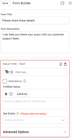
You will have to provide the following details to configure a text field on the form.
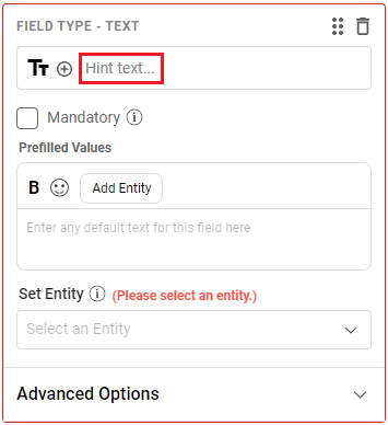
Hint Text
This text is a placeholder for the field and will be visible on this Text field before the user starts typing on this field. To add the placeholder, click on Hint Text as shown below.
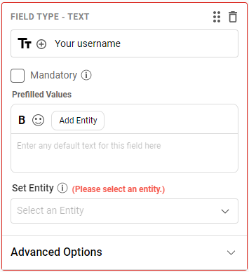
Example for Text -
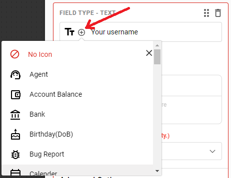
Form Icon
There is a dropdown of form icons available which can be used to add an icon for this Text field. The default icon is
To select another icon, click on the + symbol.
Mandatory
Marking a field Mandatory will ensure that the user is providing a value for this Text field.
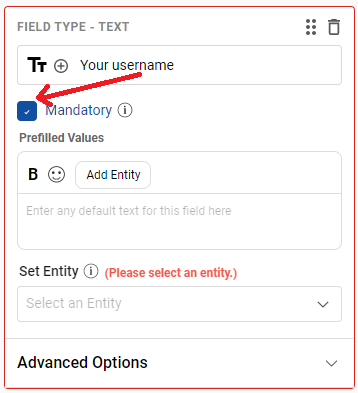
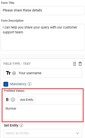
Prefilled Values
This option lets you define a default/prefilled value for the form field. The value that you can add to this section can be either Static or Dynamic.
Static: Add any fixed, hard coded value. In this case, we highly recommend using a Global Constant here.
Dynamic: Click on Add Entity (or Add Variable in case of output node) to add a dynamic value in this field. When the form will be rendered, this field will be automatically populated with the corresponding value of the entity/variable.
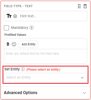
Set Entity
This option will provide you with a dropdown of all the entities present on the step where you are adding Form HSL. You can select the entity whose value you want to capture using this Text field.
Advanced Options
This field gives you Validation options that lets you add validation and the corresponding error message to display if the user is providing incorrect input in this particular field.
i. Default Validation
These are the existing types of validations present that you can choose from.
- Any: As the name suggests. This will allow any text to pass. Basically, there will be no validation to this field.
- Alphabet (without whitespace): This can be used to capture one word entries like first names. Example, Bruce, Clark, Diana, etc.
- Alphabet (with whitespace): This can be used to capture multiple word entries like full names. Example, Bruce Wayne, Clark Kent, Diana Prince, etc.
- Alphanumeric (without whitespace): This can be used to capture Alphanumeric values without any space. Example, Card number - ABCH1234N
- Alphanumeric (with whitespace): This can be used to capture Alphanumeric values containing spaces. Example, Address in one line - 221B Baker Street, London
-
Fixed Length: This can be used when the text entered has to be of a specific length. Example, if the length validation is set to be 4, then only words of length 4 characters will be allowed like tree, milk, etc.
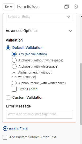
ii. Custom Validation
Custom Validation accepts custom regex patterns. This is the most powerful validation functionality. The bot builder can use varied regex patterns to enable their fields to validate different input formats like credit card number, PAN card numbers, etc.
Error Message
If any validation goes wrong, we can configure Error Message to inform the users that they have given an incorrect input.
2. Picker
Picker field is used when you want a user to select any one option from the given multiple options using the dropdown. Example, list of cities in India.
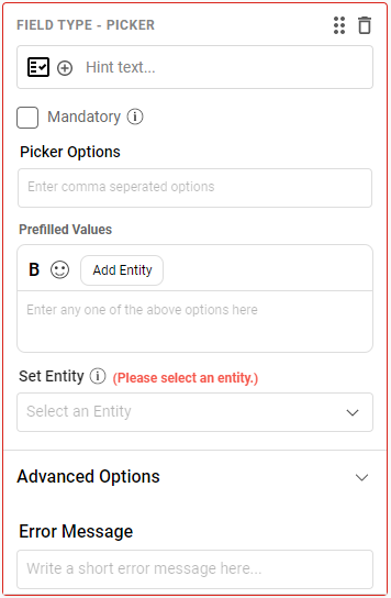 To configure a Picker field, you will have to provide following details.
-
Picker - Click on the Picker text to add a placeholder for the Picker field.
Example, Please select a city Icon - Select an icon from the dropdown.
Mandatory - Enabling the Mandatory checkbox will ensure the user is selecting a value from the dropdown.
-
Picker Options - Enter the comma-separated dropdown values
For above example of list of cities - Mumbai, Delhi, Kolkata, Chennai, Banglore Prefilled Values - This space helps to define the default/pre-filled values for the form field.
Set Entity - Select the entity to capture the value from the dropdown.
Error Message - If the user does not select a value from the dropdown, this error message will be shown to the user which will indicate the user to select an option from the dropdown.
3. Number
Number field can be used to get number inputs from the user. For example, Mobile number.
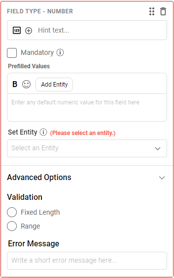
To configure a Number field, you will have to provide the following details.
-
Number - Click on the Number text to add a placeholder for this Number field.
Example, Please enter your mobile Icon - Select an icon from the dropdown.
Mandatory - Enabling the Mandatory checkbox will ensure the user is providing a value.
Prefilled Values - This space helps to define the default/pre-filled values for the form field.
Set Entity - Select the entity from the dropdown to capture the number.
-
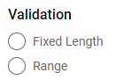
Validation - There are two different types of validation available
- Fixed Length - This validation specifies that the number entered has to be of a specific length.
-
Range - This validation mentions the range of digits it can accept. If a user inputs anything more or less than the range, it is treated as an invalid value.
- Error Message - If the user does not provide a value of either fixed length or in the specified range, this error message will be shown to the user which will indicate the user to provide a number value.
4. Email
Email can be used to get the email id from the user.
 To configure an Email field, you will have to provide the following details.
-
Email - Click on the Email text to add a placeholder for the Email field.
Example, Please provide your email id Icon - Select an icon from the dropdown.
Mandatory - Enabling the Mandatory checkbox will ensure the user is providing the email id.
Prefilled Values - This space helps to define the default/pre-filled values for the form field.
Set Entity - Select the entity from the dropdown to capture the email id.
Error Message - If the user does not provide an email id, this error message will be shown to the user which will indicate the user to provide their correct email id.
5. Date
Date field type can be used to accept dates from the user.
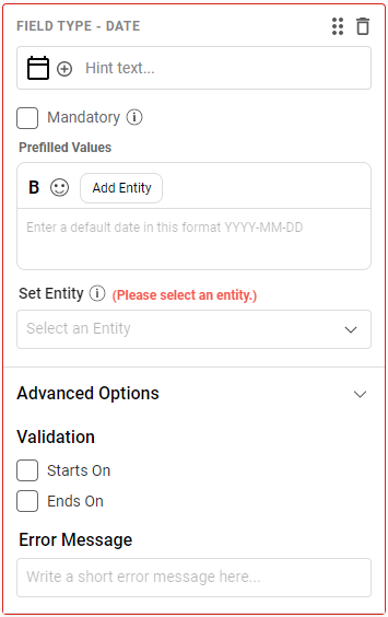
To configure a Date field, you will have to provide the following details.
-
Date - Click on the Date text to add a placeholder for the Date field.
Example, Check-in Date Icon - Select an icon from the dropdown.
Mandatory - Enabling the Mandatory checkbox will ensure the user is providing the date.
Prefilled Values - This space helps to define the default/pre-filled values for the form field.
Set Entity - Select the entity from the dropdown to capture the date.
-
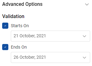
Validation - You can mention both the Start Date and End Date from which the user can select any one date or you can set either of them.
For example, if the Start Date is 01-01-2001 and the End Date is 01-01-2099, then the user will only be able to see the dates between this range
- Error Message - If the user did not select any date, this error message will be shown to the user which will indicate the user to select a date.
6. Time
Time field is used to get the time from a user. It uses the clock widget where user can select the time.
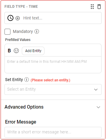
To configure a Time field, you will have to provide the following details.
Time - Click on the Time text to add a placeholder for the Time field. For example, Check-in Time
Icon - Select an icon from the dropdown.
Mandatory - Enabling the Mandatory checkbox will ensure the user is providing the time.
Prefilled Values - This space helps to define the default/pre-filled values for the form field.
Set Entity - Select the entity from the dropdown to capture the time.
Error Message - If the user does not provide any time, this error message will be shown to the user which will indicate the user to provide the time.
7. Search
Search field will help you create search options on the bot. This is similar to the Picker field. In the Picker field, you have to mention comma-separated values whereas, in Search, the dropdown is populated using API.
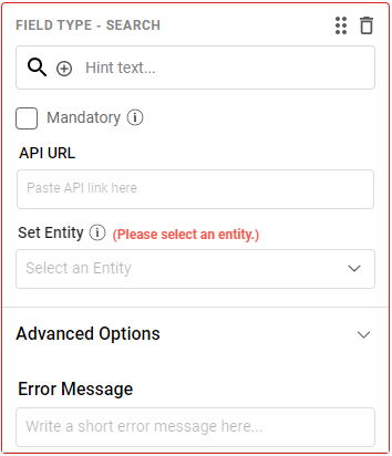
To configure a Search field, you will have to provide the following details.
Search - Click on the Search text to add a placeholder for the Search field. For example, Search my City.
Icon - Select an icon from the dropdown.
Mandatory - Enabling the Mandatory checkbox will ensure the user is either selecting or providing a value.
API - When we want some custom response or inputs from an external API, we put the API URL here.
This API's Request and Response format is mentioned below.
Request:
<YOUR API URL>?query=<the actual search string>&user_id=<actual user_id of that user>&user_name=<user name if present else undefnied>

Response:
{
 "success": true,
 "data": [{
 "title": "<title of the first element in the search result>"
 }, {
 "title": "<title of the second element in the search result>"
 }],
 "query": "pune",
 "error": ""
}
Set Entity - Select the entity from the dropdown to capture the value.
Error Message - If the user does not select an option from the dropdown, this error message will be shown to the user which will indicate the user to provide or select the value.
8. Date of Birth
Date of Birth field is used to accept a date from the user. This field does not allow users to select future dates.
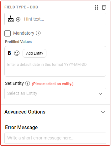
To configure a Date of Birth field, you will have to provide the following details -
Text - Click on Hint Text to add a placeholder for the Date of Birth field. For example, Please select your Date of Birth.
Icon - Select an icon from the dropdown.
Mandatory - Enabling the Mandatory checkbox will ensure the user is providing the date.
Prefilled Values - This space helps to define the default/pre-filled values for the form field.
Set Entity - Select the entity from the dropdown to capture the date.
Error Message - If the user does not provide any date, this error message will be shown to the user which will indicate the user to provide the date.
9. Multi Picker
Multi Picker field is used to provide the user with checkboxes to select more than one option from the given list of options.
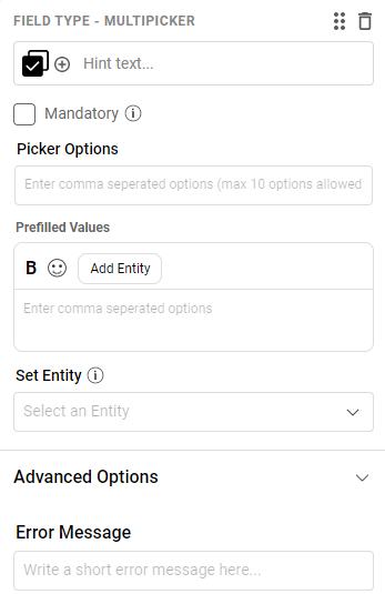
To configure a Multi Picker field, provide the following details:
Picker - Click on Hint text to add a placeholder for the Multi Picker field.
Example, Please select the cities.Icon - Select an icon from the drop-down.
Mandatory - Enabling this checkbox will ensure that the user is selecting a value from the drop-down.
Picker Options - Enter the values that must appear in this drop-down. These values must be comma-separated.
For the above example of a list of cities - Mumbai, Delhi, Kolkata, Chennai, Bangalore.Prefilled Values: This space helps to define the default/pre-filled values for the form field.
Set Entity - Select the entity to capture the value(s) from the drop-down. The values coming from Multi Picker field will be in a comma-separated format like "Option-1, Option-2, Option-3, ......". This is why we need a regex entity here to capture the values.
Error Message - If the user does not select a value from the drop-down, this error message will be shown to the user indicating the user to select an option from the drop-down.
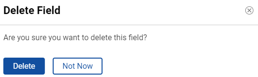
Deleting a Form Field
You can delete a particular Form Field using the delete button visible on the right side of the field.
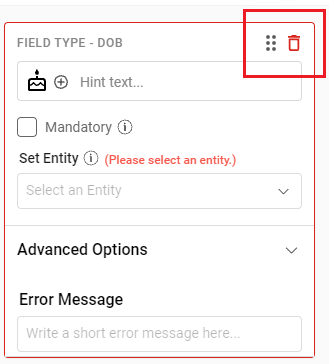
The pop-up appears to confirm if you want to delete the field.
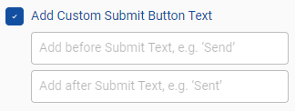
Customize Send Button
There is a Send button that appears on the form which the user has to click to send the form details. Once the user clicks on Send button, the text appearing on the button changes to Sent.
You can customize this text which appears on the button by enabling the Add Custom Submit Button Text checkbox and providing the before and after text for the buttons.
Examples for custom Button Text - Register, Submit, Proceed, etc
Re-order the Form Fields
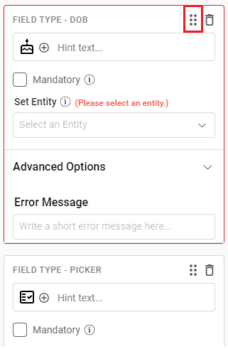
You can restructure the form fields and organize them again once they all have been created using the grip option as shown below.
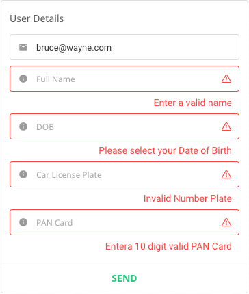
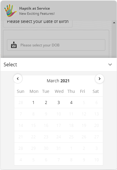
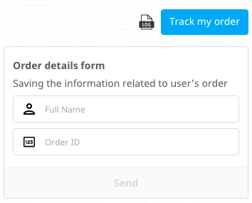
Form HSL on the bot
Using the fields above once we have completed building the bot, it will be displayed as shown below.
Error messages on the various form fields which we configured come up right below the respective field as shown below.