UI elements supported on Zendesk Chat
- Getting Started
- Bot Building
- Smart Agent Chat
- Conversation Design
-
Developer Guides
Code Step Integration Static Step Integration Shopify Integration SETU Integration Exotel Integration CIBIL integration Freshdesk KMS Integration PayU Integration Zendesk Guide Integration Twilio Integration Razorpay Integration LeadSquared Integration USU(Unymira) Integration Helo(VivaConnect) Integration Salesforce KMS Integration Stripe Integration PayPal Integration CleverTap Integration Fynd Integration HubSpot Integration Magento Integration WooCommerce Integration Microsoft Dynamics 365 Integration
- Deployment
- External Agent Tool Setup
- Analytics & Reporting
- Notifications
- Commerce Plus
- Troubleshooting Guides
- Release Notes
Zendesk Chat allows a business to send structured messages to its customers. You can use a wide variety of media and interactive message types to create rich conversational experiences with your users.
The following table will help you understand the UI compatibility of different Chat Elements.
Zendesk Web SDK |
Haptik Web SDK |
|
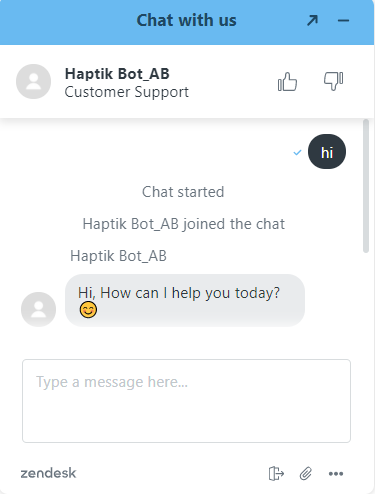
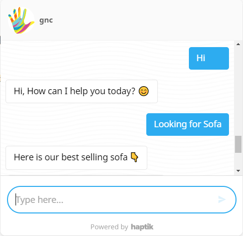
Text
This element can be used to send text messages.
Limitation: The maximum number of characters that a user can enter into the Zendesk text field is 65,536.
| |
 |
 |
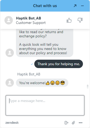
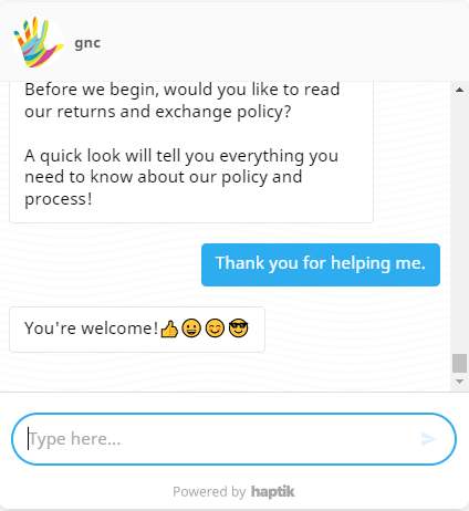
Emoji It displays any emoji sent in the form of text messages. Mobile users can use the emoji keyboard on their devices to send them. Limitation: It does not include a visual emoji selector on the Zendesk widget at the moment. | |
 |
 |
|
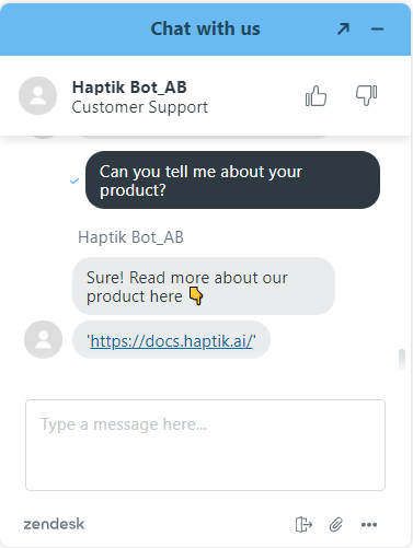
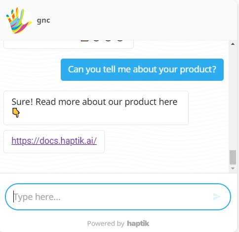
Links
The link opens a URL when tapped or clicked.
Limitation: Hyperlinks will be shown as it is. However, deep links in the form of buttons are possible on the Haptik SDK, but not on Zendesk. | |
 |
 |
|
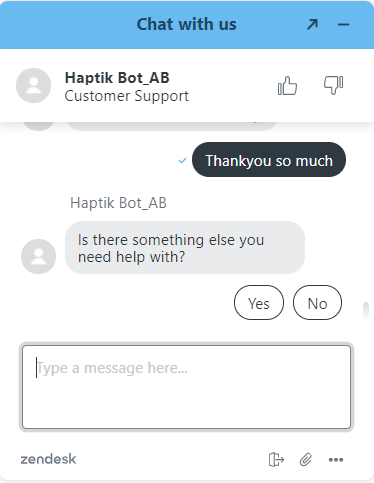
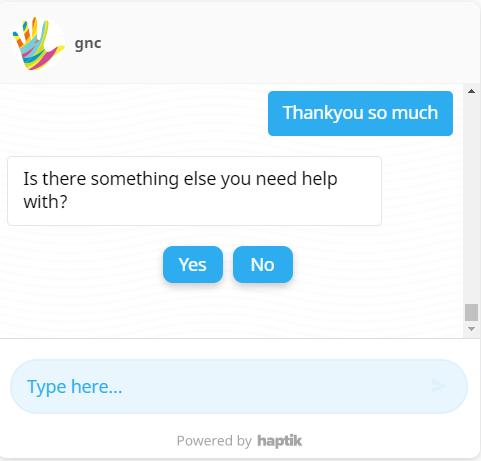
Quick Reply
Quick Replies are a great way to suggest various courses of action to a user. Once you select a Quick Reply, the remaining quick replies will disappear from the widget. Your selection is then passed to the conversation as per your input.
Limitation: The quick response limit is 5 seconds, and you can add up to 11 Quick Replies for Zendesk as well as Haptik SDK.
| |
 |
 |
|
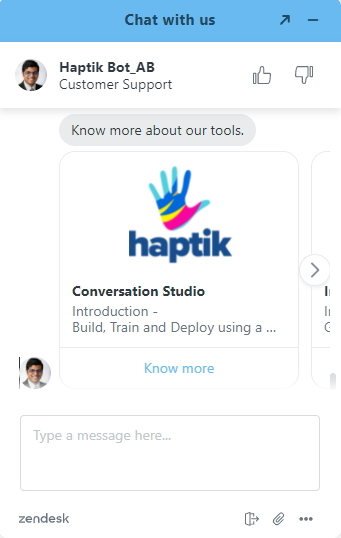
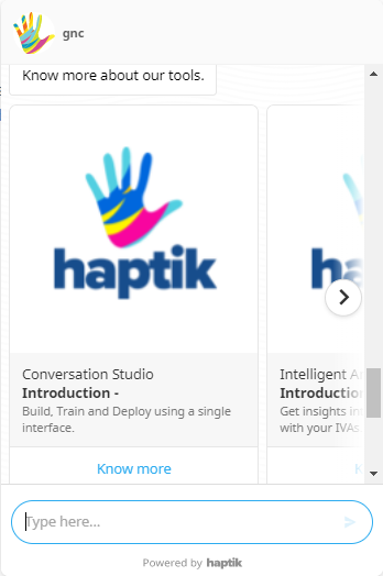
Carousels
A Carousel is a horizontally scrollable set of catalog options. Each option is displayed as a card with an image, text, description with buttons that can be either a link or plain text. The carousel action buttons formats supported are text and link (which opens a web link). Limitation: Zendesk supports up to a maximum of 3 carousel catalog items. 30 characters are the limit for text in buttons. 3 actionable buttons are supported. 140 characters are the limit for text in the Carousel descriptions. (Subtitles in the carousel reflect as a description on Zendesk.) | |
 |
 |
|
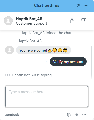
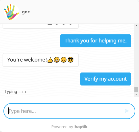
Typing Indicator
It can show that the bot is replying with a typing animation. | |
 |
 |
|
Buttons
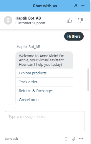
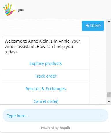
Buttons can trigger replies, weblinks, purchases, and more. The button does not disappear after the user taps on it, and therefore it can be clicked multiple times. Limitation: Number of buttons allowed - 7 Character limit: 70 characters are supported on the buttons of Haptik SDK, and 25 characters are supported on the buttons of Zendesk. | |
 |
 |
|
Image
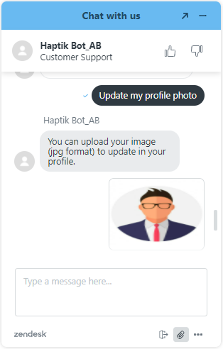
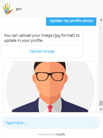
Receiving images is supported on the Zendesk web SDK. Images can be uploaded using the attachment icon at the bottom of the widget in the following file types: PNG (.png), JPEG (.jpeg), GIF (.gif). Limitation: Images sent and received to the web are restricted to a file size limit of 20MB. | |
 |
 |
|
File
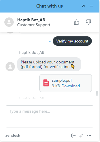
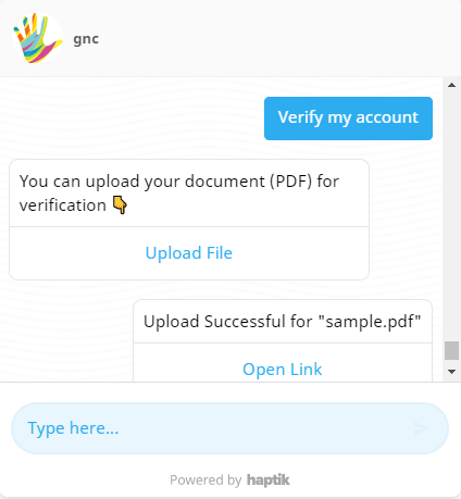
Partially Supported (txt file upload on Zenchat widget). For the Zendesk widget, users can send any file from their computer or mobile device by choosing the attach icon where users can attach the file. Agents and visitors can send the following file types: PDF (.pdf) and Text (.txt). Limitations: Files sent and received to the Web are restricted to a file size limit of 20MB. | |
 |
 |
|
Prechat Capture
(Not supported on Haptik SDK)
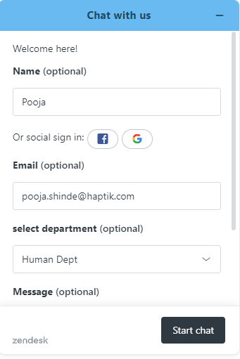
Prechat Capture is an add-on built by Zendesk chat that leverages form message type and allows you to capture a user’s name and email before the start of a conversation. When enabled, the chat input is disabled and the user is greeted by a welcome message and a form asking for their name and email, and details. | |
 |
Not supported on Haptik Web SDK. |
|
Form
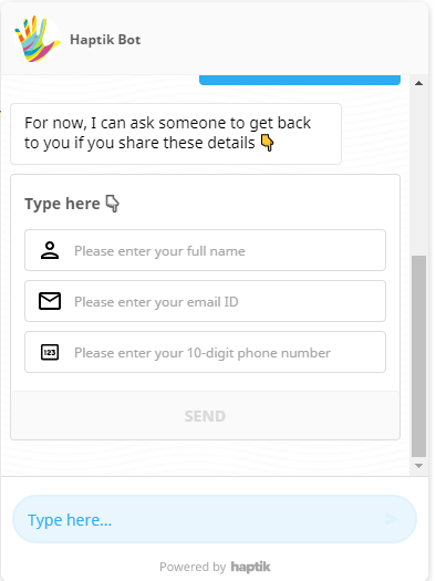
Forms can be used for collecting data from the user. Currently, forms are supported only on Haptik SDK.
| |
Not supported on Zendesk Web SDK. |
 |
|
GIF
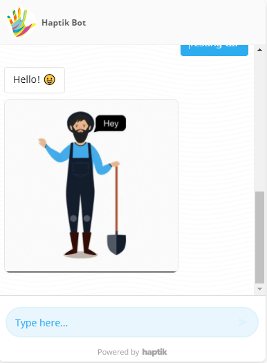
GIFs are a static and animated form of images. Currently, GIFs are supported only on Haptik SDK. They are converted to PNG files when attached to chat sessions.
| |
Not supported on Zendesk Web SDK. |
 |
|
Webview
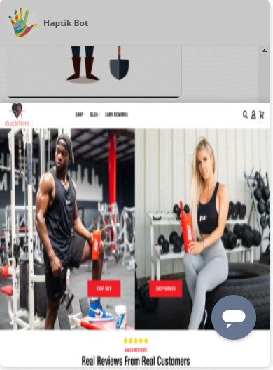
Webview buttons allow you to send Conversations Extensions to render custom experiences on top of the conversation when the button is tapped while keeping the user in the same seamless flow. | |
Not supported on Zendesk Web SDK. |
 |
|
Menu
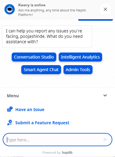
Menus are used for giving a user an idea of the flows that can be tried. Currently, Menus are supported only on Haptik SDK.
| |
Not supported on Zendesk Web SDK. |
 |
|
Calendar
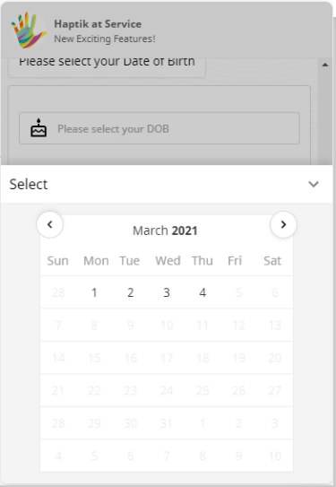
The Calendar can be used for displaying the calendar on the bot. Currently, the Calendar is supported only on Haptik SDK. | |
Not supported on Zendesk Web SDK. |
 |
|
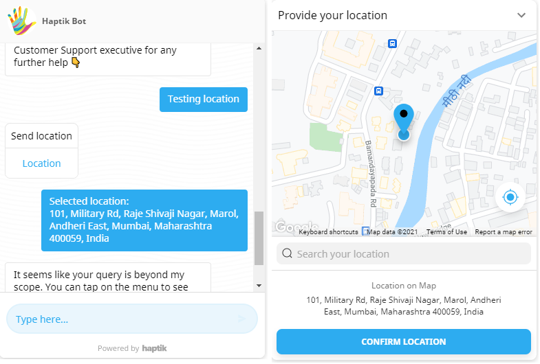
Location
The location allows you to send the location to the bot, in a conversation. Currently, the location is supported only on the Haptik SDK.
| |
Not supported on Zendesk Web SDK. |
 |
